Section - 5 Visualization 📉
Making visualizations using the ggplot2 package (Wickham, Chang, et al. 2020) is one of the very best tools available in the R ecosystem. The gg in ggplot2 stands for the Grammar of Graphics, which is essentially the idea that many different types of charts share the same underlying building blocks, and that they can be put together in different ways to make charts that look very different from each other. In Hadley Wickham’s (the creator of the package) own words, “a pie chart is just a bar chart drawn in polar coordinates”, “They look very different, but in terms of the grammar they have a lot of underlying similarities.”
5.1 Basics - ggplot2
So how does ggplot2 actually work? “…in most cases you start with ggplot(), supply a dataset and aesthetic mapping (with aes()). You then add on layers (like geom_point() or geom_histogram()), scales (like scale_colour_brewer()), faceting specifications (like facet_wrap()) and coordinate systems (like coord_flip()).” - ggplot2.tidyverse.org/.
Let’s break this down step by step.
"start with ggplot(), supply a dataset and aesthetic mapping (with aes())
Using the ggplot() function we supply the dataset first, and then define the aesthetic mapping (the visual properties of the chart) as having the date_time_utc on the x-axis, and the price_usd on the y-axis:
![]()
We were expecting a chart showing price over time, but the chart now shows up but is blank because we need to perform an additional step to determine how the data points are actually shown on the chart: “You then add on layers (like geom_point() or geom_histogram())…”
We can take the exact same code as above and add + geom_point() to show the data on the chart as points:
ggplot(data = cryptodata, aes(x = date_time_utc, y = price_usd)) +
       # adding geom_point():
       geom_point()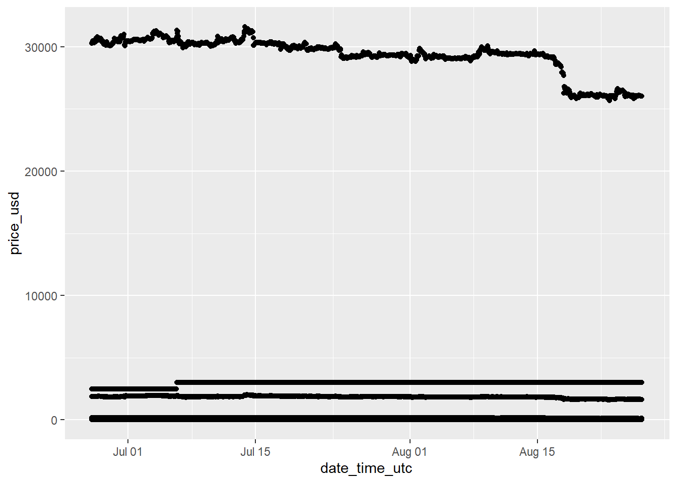
The most expensive cryptocurrency being shown, “BTC” in this case, makes it difficult to take a look at any of the other ones. Let’s try zooming-in on a single one by using the same code but making an adjustment to the data parameter to only show data for the cryptocurrency with the symbol ETH.
Let’s filter the data down to the ETH cryptocurrency only and make the new dataset eth_data:
We can now use the exact same code from earlier supplying the new filtered dataset for the data argument:
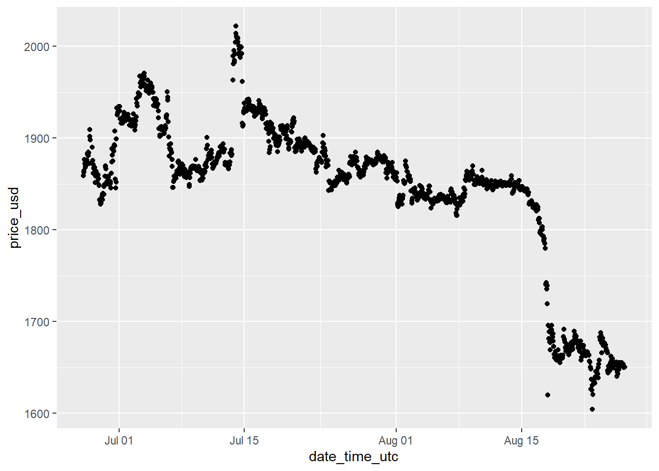
This is better, but geom_point() might not be the best choice for this chart, let’s change geom_point() to instead be geom_line() and see what that looks like:
ggplot(data = eth_data,
       aes(x = date_time_utc, y = price_usd)) +
       # changing geom_point() into geom_line():
       geom_line()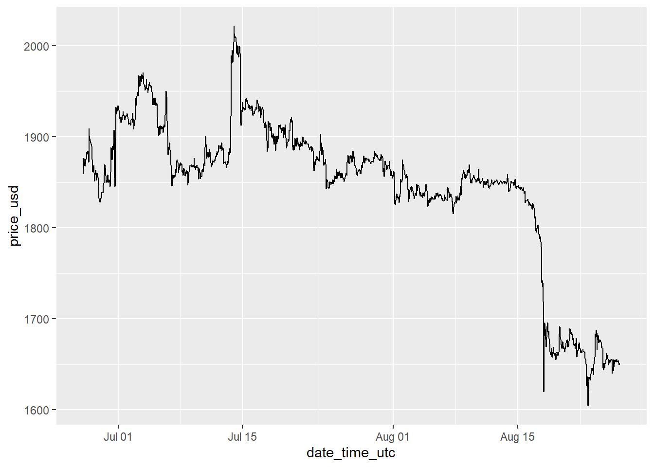
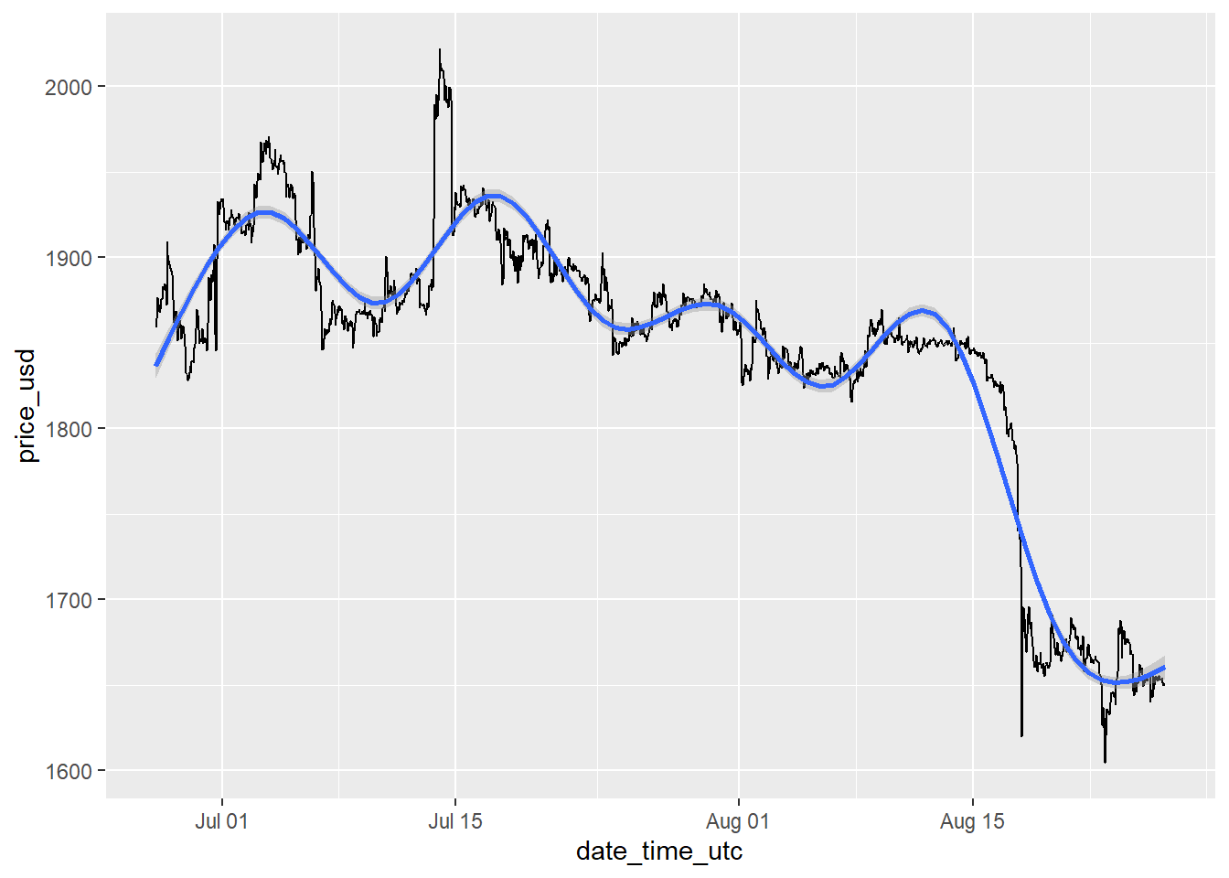
Let’s save the results as an object called crypto_chart:
We can add a line showing the trend over time adding stat_smooth() to the chart:
And we can show the new results by calling the crypto_chart object again:
One particularly nice aspect of using the ggplot framework, is that we can keep adding as many elements and transformations to the chart as we would like with no limitations.
We will not save the result shown below this time, but to illustrate this point, we can add a new line showing a linear regression fit going through the data using stat_smooth(method = 'lm'). And let’s also show the individual points in green. We could keep layering things on as much as we want:
crypto_chart +
        # Add linear regression line
        stat_smooth(method = 'lm', color='red') +
        # Add points
        geom_point(color='dark green', size=0.8)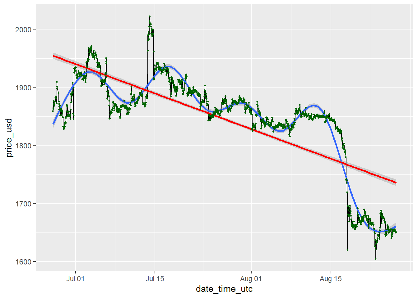
By not providing any method option, the stat_smooth() function defaults to use the method called loess, which shows the local trends, while the lm model fits the best fitting linear regression line for the data as a whole. The results shown above were not used to overwrite the crypto_chart object.
It is of course important to add other components that make a visualization effective, let’s add labels to the chart now using xlab() and ylab(), as well as ggtitle() to add a title and subtitle:
crypto_chart <- crypto_chart +
                  xlab('Date Time (UTC)') +
                  ylab('Price ($)') +
                  ggtitle(paste('Price Change Over Time -', eth_data$symbol),
                          subtitle = paste('Most recent data collected on:',
                                           max(eth_data$date_time_utc),
                                           '(UTC)'))
# display the new chart
crypto_chart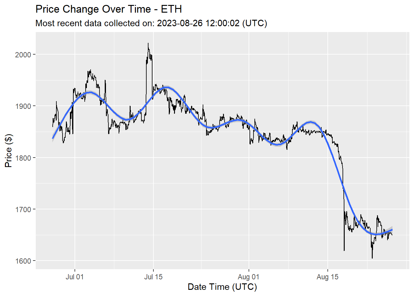
The ggplot2 package comes with a large amount of functionality that we are not coming even close to covering here. You can find a full reference of the functions you can use here:
https://ggplot2.tidyverse.org/reference/
What makes the ggplot2 package even better is the fact that it also comes with a framework for anyone to develop their own extensions. Meaning there is a lot more functionality that the community has created that can be added in importing other packages that provide extensions to ggplot.
5.2 Using Extensions
5.2.1 ggthemes
To use an extension, we just need to import it into our R session like we did with ggplot2 and the rest of the packages we want to use. We already loaded the ggthemes (Arnold 2019) package in the Setup section so we do not need to run library(ggthemes) to import the package into the session.
We can apply a theme to the chart now and change the way it looks:
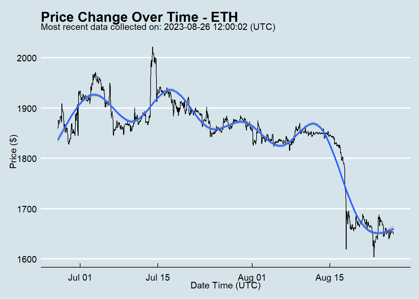
See below for a full list of themes you can test. If you followed to this point try running the code crypto_chart + theme_excel() or any of the other options listed below instead of + theme_excel():
https://yutannihilation.github.io/allYourFigureAreBelongToUs/ggthemes/
5.2.2 plotly
In some cases, it’s helpful to make a chart responsive to a cursor hovering over it. We can convert any ggplot into an interactive chart by using the plotly (Sievert et al. 2020) package, and it is super easy!
We already imported the plotly package in the setup section, so all we need to do is wrap our chart in the function ggplotly():
Use your mouse to hover over specific points on the chart above. Also notice that we did not overwrite the crypto_chart object, but are just displaying the results.
If you are not looking to convert a ggplot to be interactive, plotly also provides its own framework for making charts from scratch, you can find out more about it here:
5.2.3 ggpubr
The ggpubr (Kassambara 2020) extension provides a lot of functionality that we won’t cover here, but one function we can use from this extension is stat_cor, which allows us to add a correlation coefficient (R) and p-value to the chart.
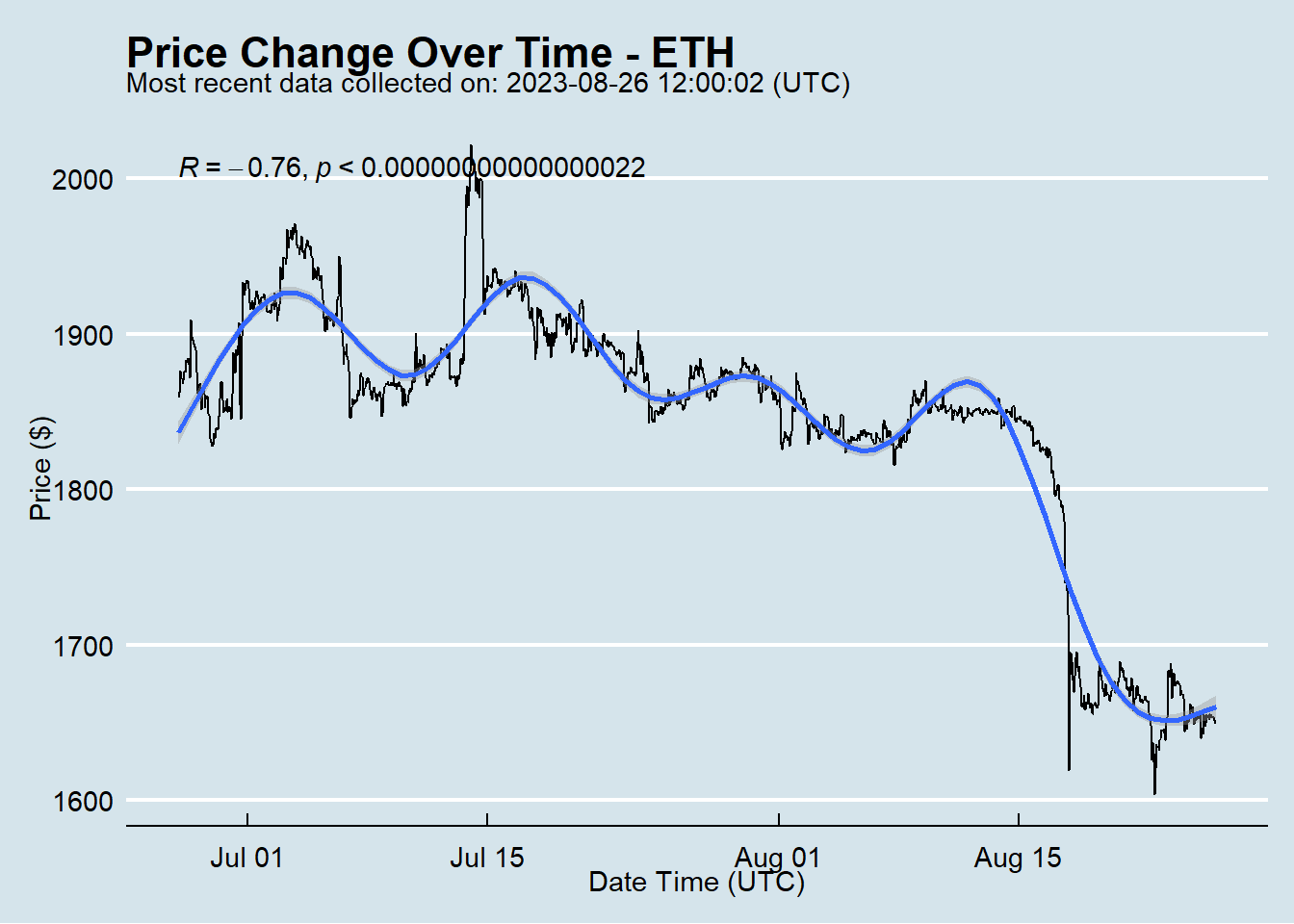
We will dive deeper into these metrics in the section where we evaluate the performance of the models.
5.2.4 ggforce
The ggforce package (Pedersen 2020) is a useful tool for annotating charts. We can annotate outliers for example:
crypto_chart <- crypto_chart +
        geom_mark_ellipse(aes(filter = price_usd == max(price_usd),
                              label = date_time_utc,
                              description = paste0('Price spike to $', price_usd))) +
        # Now the same to circle the minimum price:
        geom_mark_ellipse(aes(filter = price_usd == min(price_usd),
                              label = date_time_utc,
                              description = paste0('Price drop to $', price_usd)))
When using the geom_mark_ellipse() function we are passing the data argument, the label and the description through the aes() function. We are marking two points, one for the minimum price during the time period, and one for the maximum price. For the first point we filter the data to only the point where the price_usd was equal to the max(price_usd) and add the labels accordingly. The same is done for the second point, but showing the lowest price point for the given date range.
Now view the new chart:
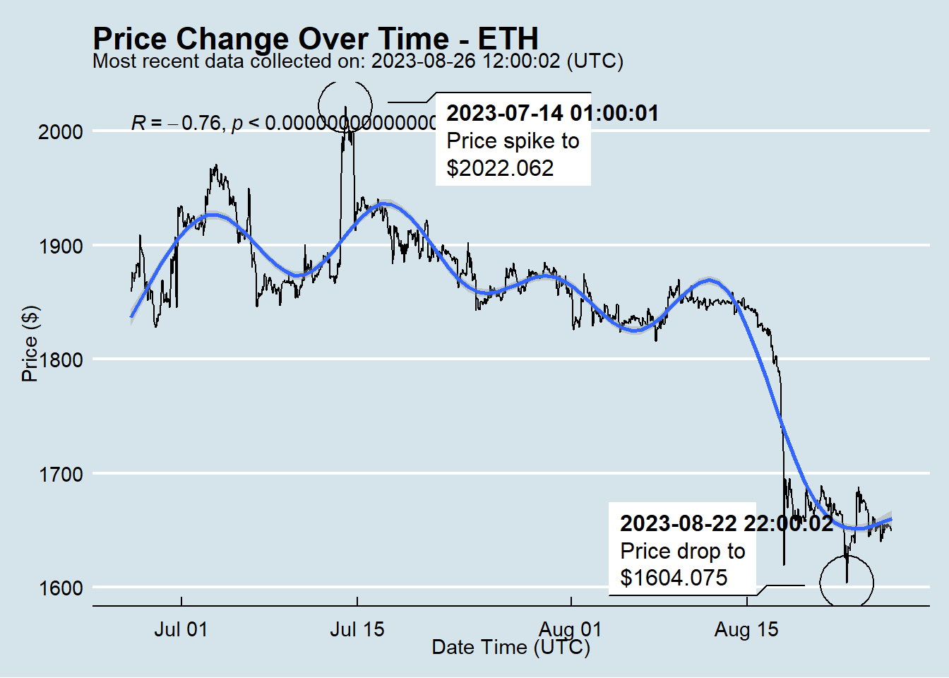
Notice that this chart is specifically annotated around these points, but we never specified the specific dates to circle, and we are always circling the maximum and minimum values regardless of the specific data. One of the points of this document is to show the idea that when it comes to data analysis, visualizations, and reporting, most people in the workplace approach these as one time tasks, but with the proper (open source/free) tools automation and reproducibility becomes a given, and any old analysis can be run again to get the exact same results, or could be performed on the most recent view of the data using the same exact methodology.
5.2.5 gganimate
We can also extend the functionality of ggplot by using the gganimate (Pedersen and Robinson 2020) package, which allows us to create an animated GIF that iterates over groups in the data through the use of the transition_states() function.
animated_prices <- ggplot(data = mutate(cryptodata, groups=symbol),
                          aes(x = date_time_utc, y = price_usd)) +
                          geom_line() +
                          theme_economist() +
                          transition_states(groups) +
                          ggtitle('Price Over Time',subtitle = '{closest_state}') +
                          stat_smooth() +
                          view_follow() # this adjusts the axis based on the group
# Show animation (slowed to 1 frame per second):
animate(animated_prices,fps=1)
## Error in `$<-.data.frame`(`*tmp*`, "group", value = ""): replacement has 1 row, data has 0We recommend consulting this documentation for simple and straightforward examples on using gganimate: https://gganimate.com/articles/gganimate.html
5.2.6 ggTimeSeries
The ggTimeSeries (Kothari 2018) package has functionality that is helpful in plotting time series data. We can create a calendar heatmap of the price over time using the ggplot_calendar_heatmap() function:
calendar_heatmap <- ggplot_calendar_heatmap(eth_data,'date_time_utc','price_usd') #or do target_percent_change here?
calendar_heatmap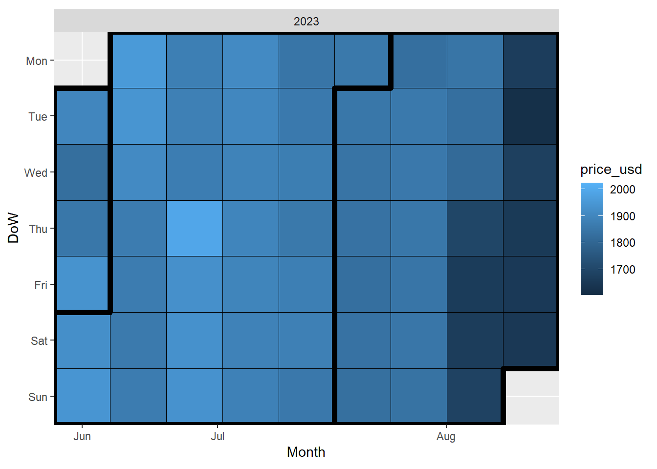
DoW on the y-axis stands for Day of the Week
To read this chart in the correct date order start from the top left and work your way down and to the right once you reach the bottom of the column. The lighter the color the higher the price on the specific day.
5.2.7 Rayshader
The previous chart is helpful, but a color scale like that can be a bit difficult to interpret. We could convert the previous chart into a 3d figure that is easier to visually interpret by using the amazing rayshader (Morgan-Wall 2020) package.
This document runs automatically through GitHub Actions, which does not have a graphical environment to run the code below, which prevents it from refreshing the results with the latest data. We are showing old results for the rayshader section below. If you have gotten to this point, it is worth running the code below yourself on the latest data to see this amazing package in action!
# First remove the title from the legend to avoid visual issues
calendar_heatmap <- calendar_heatmap + theme(legend.title = element_blank())
# Add the date to the title to make it clear these refresh twice daily
calendar_heatmap <- calendar_heatmap + ggtitle(paste0('Through: ',substr(max(eth_data$date_time_utc),1,10)))
# Convert to 3d plot
plot_gg(calendar_heatmap, zoom = 0.60, phi = 35, theta = 45)
# Render snapshot
render_snapshot('rayshader_image.png')
# Close RGL (which opens on plot_gg() command in a separate window)
rgl.close()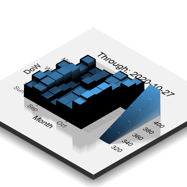
This is the same two dimensional calendar heatmap that was made earlier.
Because we can programmatically adjust the camera as shown above, that means that we can also create a snapshot, move the camera and take another one, and keep going until we have enough to make it look like a video! This is not difficult to do using the render_movie() function, which will take care of everything behind the scenes for the same plot as before:
# This time let's remove the scale too since we aren't changing it:
calendar_heatmap <- calendar_heatmap + theme(legend.position = "none")
# Same 3d plot as before
plot_gg(calendar_heatmap, zoom = 0.60, phi = 35, theta = 45)
# Render movie
render_movie('rayshader_video.mp4')
# Close RGL
rgl.close()
Click on the video below to play the output
We also recommend checking out the incredible work done by Tyler Morgan Wall on his website using rayshader and rayrender.
Awesome work! Move on to the next section ➡️ to start focusing our attention on making predictive models.
References
Arnold, Jeffrey B. 2019. Ggthemes: Extra Themes, Scales and Geoms for Ggplot2. http://github.com/jrnold/ggthemes.
Kassambara, Alboukadel. 2020. Ggpubr: Ggplot2 Based Publication Ready Plots. https://rpkgs.datanovia.com/ggpubr/.
Kothari, Aditya. 2018. GgTimeSeries: Time Series Visualisations Using the Grammar of Graphics. https://github.com/Ather-Energy/ggTimeSeries.
Morgan-Wall, Tyler. 2020. Rayshader: Create Maps and Visualize Data in 2D and 3D. https://github.com/tylermorganwall/rayshader.
Pedersen, Thomas Lin. 2020. Ggforce: Accelerating Ggplot2. https://CRAN.R-project.org/package=ggforce.
Pedersen, Thomas Lin, and David Robinson. 2020. Gganimate: A Grammar of Animated Graphics. https://CRAN.R-project.org/package=gganimate.
Sievert, Carson, Chris Parmer, Toby Hocking, Scott Chamberlain, Karthik Ram, Marianne Corvellec, and Pedro Despouy. 2020. Plotly: Create Interactive Web Graphics via Plotly.js. https://CRAN.R-project.org/package=plotly.
Wickham, Hadley, Winston Chang, Lionel Henry, Thomas Lin Pedersen, Kohske Takahashi, Claus Wilke, Kara Woo, Hiroaki Yutani, and Dewey Dunnington. 2020. Ggplot2: Create Elegant Data Visualisations Using the Grammar of Graphics. https://CRAN.R-project.org/package=ggplot2.